Develop a single code for an application to be distributed across multiple channels
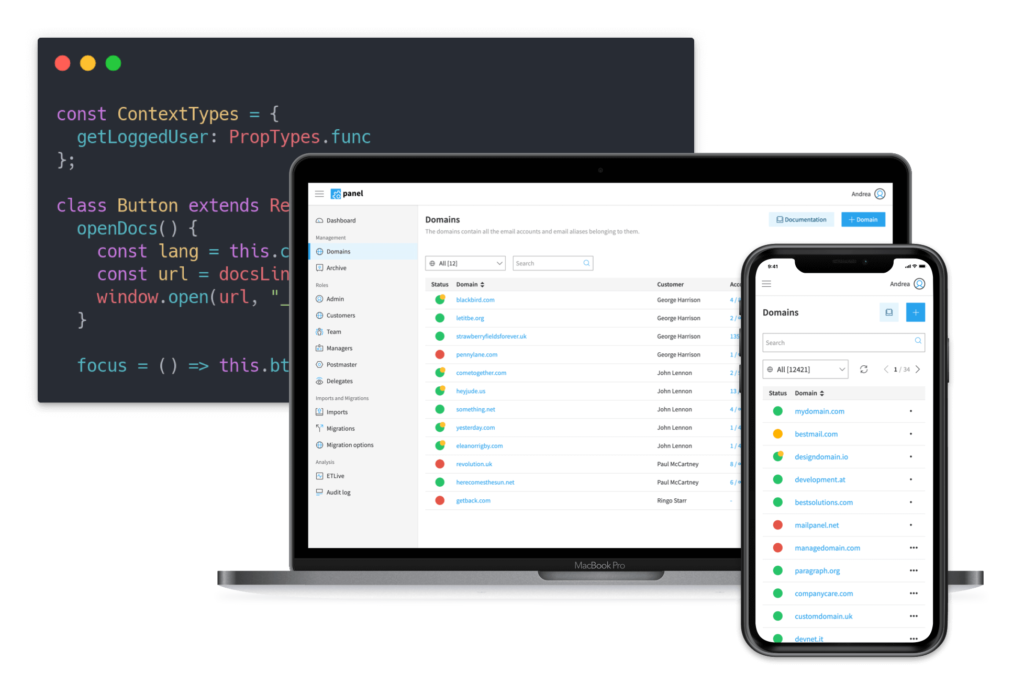
Here’s how we developed our Control Panel and its App using a single base code that allowed us to create both our Web application and the App for iOS and Android.
Our goal is to make our customers’ email management easy and powerful. Enable them to do it even when they are not in their office or close to their notebooks is a big step toward this goal.
When designing the 2.0 version of our Panel, we picked the tools we thought allowed us to distribute our product on different channels without having to maintain a different codebase for each platform. We wanted to be able to use the same code we use on the web to ship an experience suited for mobile use on Android and iOS devices.
Here it comes Javascript
Javascript borns as a scripting language (meaning: not designed to the development of full-blown applications) used primarily to add interactivity to a static web page; every time you “like” your friend’s post on Facebook, that is javascript doing its magic and showing to you the update likes counter without refreshing the whole page.
With time and the rise of the web (and probably lack of competition), this technology has matured and the needs of more interactivity brought to the idea to use Javascript to render and handle all the rendering of a page directly on the user’s client (in this case, her browser). This way the user would receive from the server the Javascript application code instead of a statically rendered HTML page.
Web site or SPA (single page application)?
The idea behind this is simple, like when you need software on your Windows pc you download a file “.exe” from the vendor’s site and install it locally on your pc, the same way when you visit a Single Page Application like our Panel (or Linkedin, Facebook, Twitter..) you receive from the server the Javascript code of the application, and your browser executes it locally drawing itself the finale interface you see on your screen.
The finale user experience is something closer to a classic desktop or mobile software than a static web site.
This way of serving applications has become extremely popular because it enables everyone who needs to distribute its services to take advantage of the omnipresence of the web as the only platform to target every customer that has access to an Internet connection.
The same code can also be packed as an App: instead of re-implementing every screen of the application in the language native of the platform you want to support (Kotlin/Java on Android, Objective-C/Swift on iOS), you can use these languages only to load a WebView (think of it as lightweight browser with no interface) that simply load the Javascript code and execute it, enabling you to render your application. This way you can use the same code and tech you have used on the web, to target mobile platforms, and using only a small percentage of native code: to load the Javascript code and when you need to interact with the device hardware (camera, accelerometer, etc..).
Re-implementing every screen and functionality in different languages is a high-cost operation that often is not sustainable for small teams and without the required knowledge. Using this solution can be a viable and highly valid solution if the nature of the product fits the constraints of this technology.
Responsive is not enough
Keeping a high priority on the mobile experience from day 1 has been crucial to achieving a great result in the user experience on smaller, touch-controlled devices.
Today there is no lack of great tools that help you building “responsive” UIs, but often is not simply a matter of resizing menus, buttons, and other elements but to adapt to a completely different set of patterns (swiping gestures, menu reach-ability).
Modern web technologies have been great. With new features, now widely supported, as CSS grids and Flexbox we have been able to build complex but highly adaptable layouts, re-using most of the components but presented in totally different ways.
The alternatives
Today when you decide to build a mobile App you have a ton of different paths, with the key difference being the position in the spectrum web-native:
- full web and distributed as a Progressive Web App
- a hybrid solution, our choice, closer to the web but with the support of native platform functionalities. The best tools that facilitate the creation of this infrastructure are Cordova and Capacitor.
- staying in the hybrid solution, but one path that moves closer to the native: NativeScript , React Native o Flutter are all technologies that let you write Javascript (or a superset of it) to control native components. This requires a major knowledge of the platform you are developing for, but it enables for sharing a large part of the codebase among the different platforms.
- the native solution, using Java/Kotlin on Android and Objective-C/Swift on Apple devices.
The hybrid solution is perfect for the kind of product we need to build, and it does not set any constraint, so we are very happy with what the modern HTML5 stack enabled us to achieve.
Download our app Panel by Qboxmail!
Keep a review and let us know what you think about it.